My final pieces are based on magazine covers which explore the surreal and beautiful side of fashion magazines like Vogue and Manipulator magazine. I chose to do magazine covers because I think this is one of the main places where aesthetics are explored in portraits quite a lot as they are sometimes trying to advertise something as much as possible. However, in the magazine covers that I am going to create, I will explore how I can show people in a more surreal and fun way without being as restricted and as focused as the commercial magazines are. I am going to implement surreal photography from artists such as David Lynch.
|
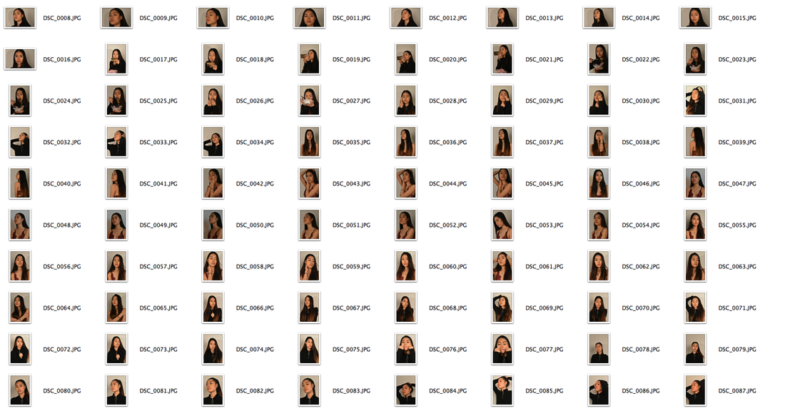
This is a photoshoot I took in studio setting where I had a model against a white background and experimented with different poses as well as lighting. I based this photoshoot off of photoshoots that Solve Sundsbo had created. I used a light with a red filter which was also inspired by a specific photoshoot of Adriana Lima where Solve Sundsbo used red lighting which filled the room which I thought created a very warm and intimate feeling which was enhanced by the poses that she was in. I felt as though I could experiment with this and combined the intimacy of Solve Sundsbo with the surreal aspects of David Lynch's work. I did this by creating a much darker lit scene which made the model look as if she was shrouded by darkness creating a feeling of mystery combined with the intimate and warm red light that I used.
|

Adriana Lima by Solve Sundsbo.
|
These are some of the images from the photoshoot which I selected as I felt that they turned out the best.


These are some of the famous magazine covers that I looked at for inspiration such as Vouge, ID and Manipulator. I came up with my own name for the magazine which was "FV." meaning face value. I chose this name because of the way that these famous magazines portray people in a flawless way and in the best way possible to advertise what they are selling like perfume and jewellery. I think that the flawless and perfect way that people are portrayed in these magazines are beautiful however, it makes people who look at them start to value their own faces less and try to achieve the looks that the models in these magazines have. Therefore, I tried to make the magazines reference the aesthetic aspect of the fashion magazines whilst being surreal and expressive.
These photos were taken with the artist Kehinde Wiley and Solve Sundsbo as inspiration. Kehinde Wiley is an artist that explores renaissance themes and paints black people on a colourful, floral background. I thought his work would be good to base my shoot off of because of how vibrant and powerful some of the poses he painted were. In my shoot I used a African print because of the patterns which were similar looking to Kehinde Wiley's backgrounds.
I experimented with the surreal aspect of my theme in these photos. This was inspired by the films I watched of David Lynch and Luis Bunuel as they had quite dark and ominous imagery. I did this by first experimenting with the shutter speed in the studio which created the distorted blur effect and then used photoshop to enhance them as well as adding a black and white filter.
These are the three final magazine covers that I produced based on the artists that I have looked at. I chose to use Solve Sundsbo, David Lynch and the mainpulator and Vogue magazines as inspiration. I also added quotations in the style of a fashion designer named Virgil Abloh who uses quotations on his clothes to usually state literal and obvious things.
I created these images from photos that I took in a studio where I experimented with dark and bright lighting where I then edited them in Photoshop. The "Renaissance" cover was based on Kehinde Wiley and his art style where he takes people and paints them in a renaissance style which looks Biblical and heroic which is what I used as inspiration. I thought this would go well with my magazine covers as I wanted to express beauty and aesthetics through colours and culture which is why I used an Asian model against an African print background to merge the cultures.
The "Surreal" cover was based on what I have seen from David Lynch. I took photos in the studio under very dark lighting and used a red filter to give a ominous and unnerving feeling to the photo which is what I felt when watching David Lynch's "Eraserhead". I merged two of the photos I took in the studio and changed the opacity of one of them to make it seem as though it were her soul or spirit that was coming out of her.
The last cover I created was called "Merging Forms" which was based on Ade Santora's photography. I wanted to be able to merge the human form which is natural and free flowing with the shapes of man-made objects such as buildings and cars to show that the man-made objects that we have created are a part of our daily lives and are almost taking control of us in this age. Merging the natural forms of people with man-made objects created a very surreal magazine cover which also showed a lot of contrast between the two shapes. I used a photo that I took of the skyline and merged them with a photo I took in the studio as well as the industrial photo of the city which was done by placing them on top of each other and changing the opacity of each of them which was similar to the multiple exposure technique that Ade Santora uses.
